Colour Club Studio
The Concept
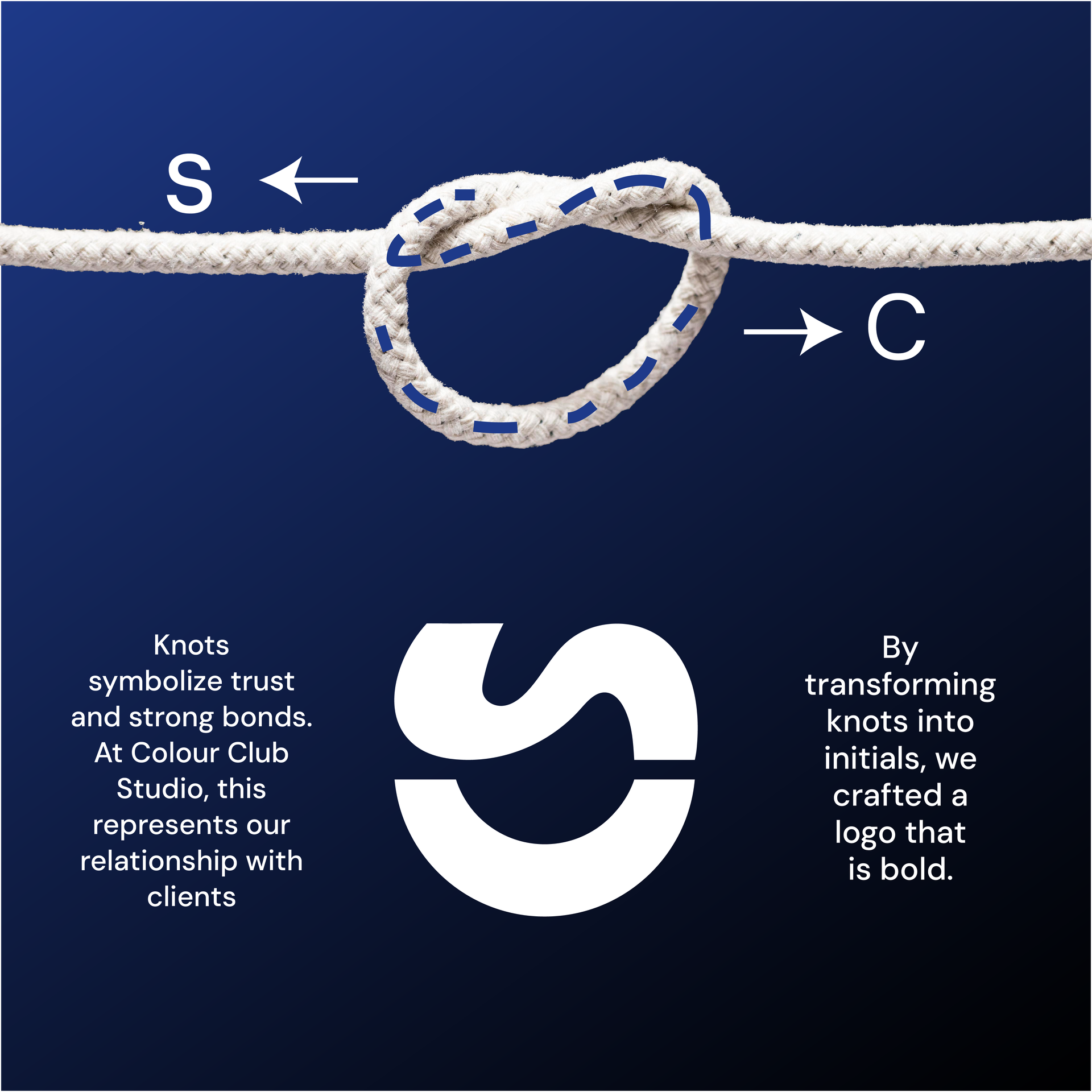
Trust & CollaborationI wanted the identity to reflect the relationship behind good design — a strong connection between the client and the designer.
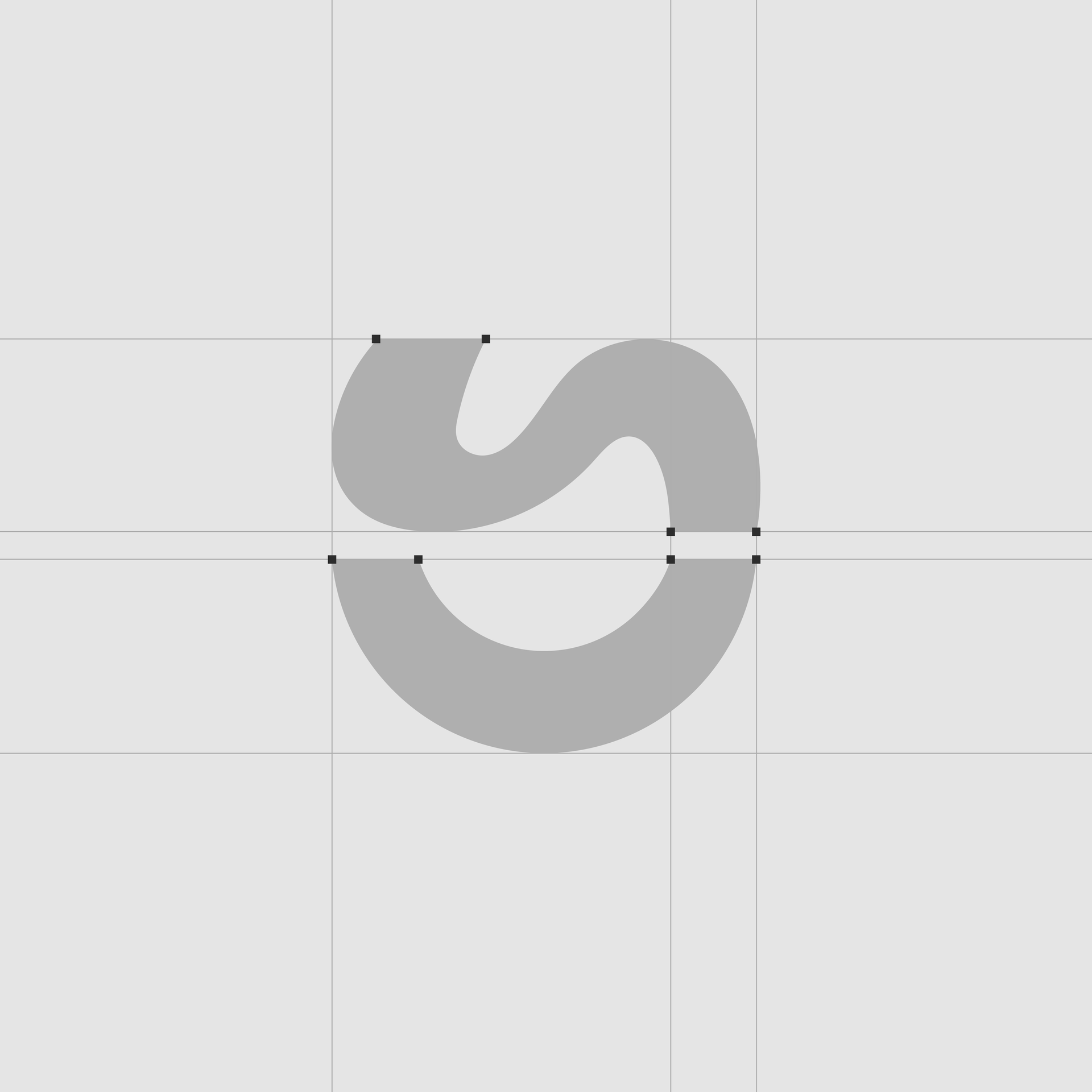
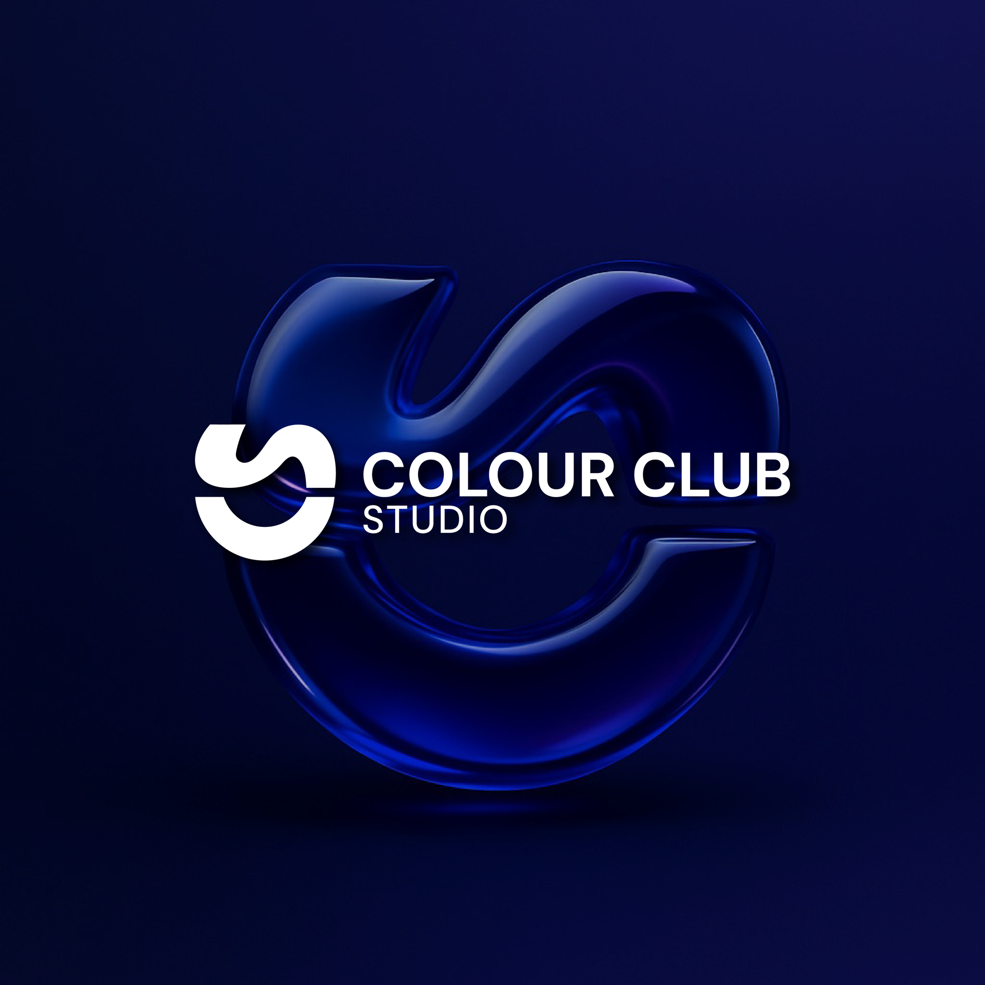
I developed a knot symbol to represent trust, collaboration and the bond created through that relationship. The form also subtly incorporates the C and S initials, giving the symbol both a conceptual and personal connection to the studio name.
The Identity & System
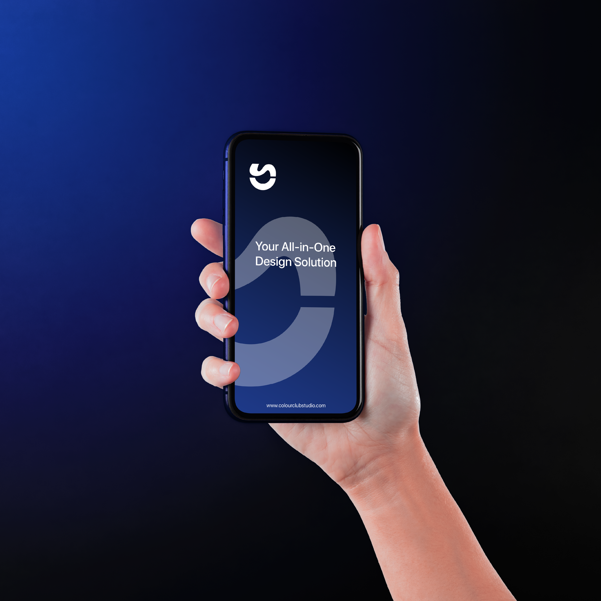
Bold, Confident & ModularI kept the visual language bold and simple, allowing the knot to work as a recognisable mark across digital and physical applications.
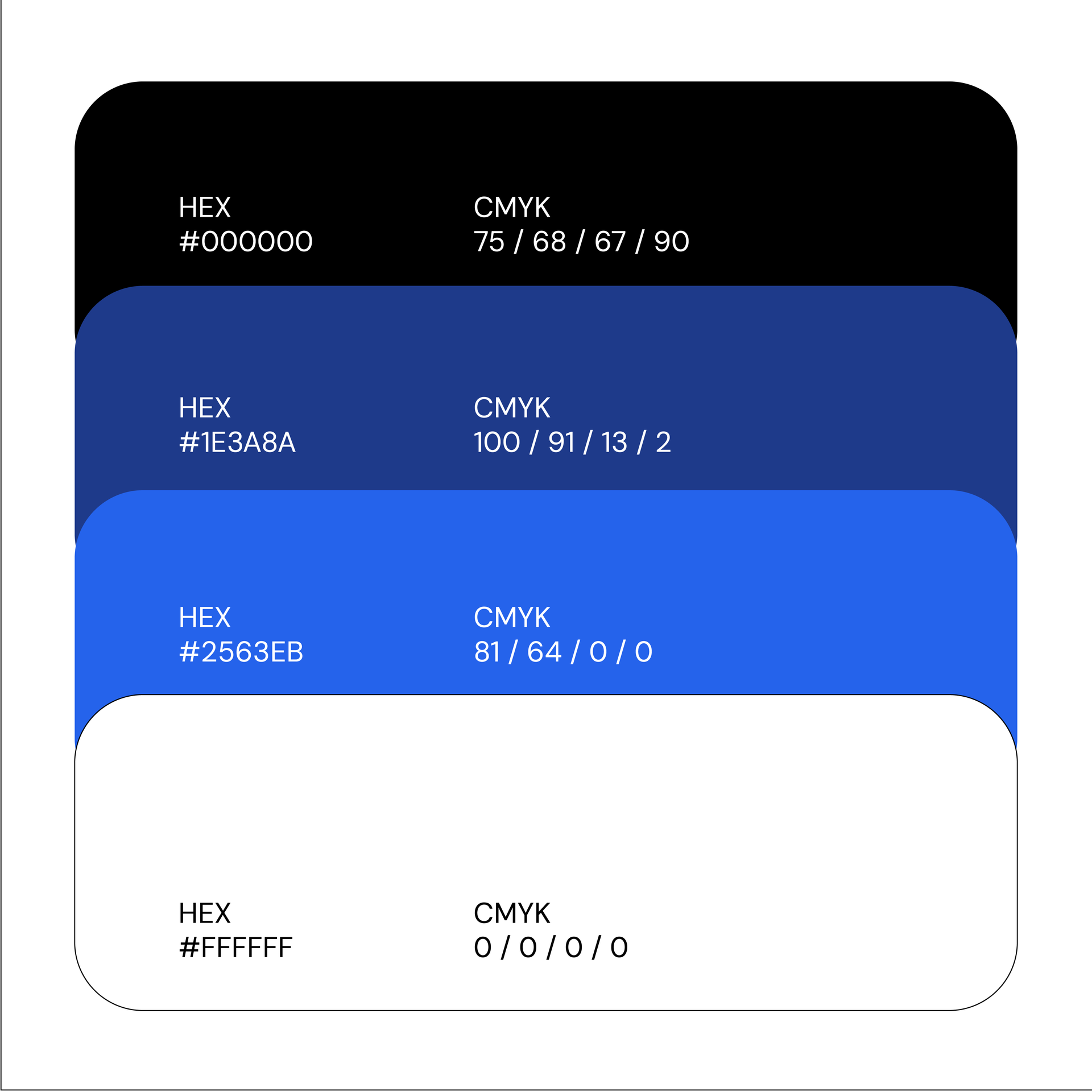
A deep blue and black palette gives the identity a confident, contemporary feel while keeping the focus on the symbol and its meaning.

The Result
Memorable Studio PresenceThe identity combines a simple visual metaphor with a distinctive mark, creating a studio brand that feels confident, collaborative and memorable.